Posts

New Foot Chinko game with new tricks

We are happy to announce we are working on a new Foot Chinko chapter.


new-footchinko-eurocup 

It’s been a long time since the original game was launched and we were excited about the possibility of developing a new Foot Chinko game. During this time it seems that our little creature has been growing in popularity. Although the game was released over a year ago, enthusiastic players keep on uploading videos: Foot Chinko on youtube

Is it our imagination or does it look like searches on google for the keyword “foot chinko” are growing? Results on google trends

We are going to release an HTML5 exclusive version of the game for Spil Games. This version will feature the Eurocup 2016 and will include a couple of new mechanics.

We are also considering a native version of the game for iOS, Android and Windows phone using Unity. By combining the old game levels with the new ones, we could have almost 150 different levels, but the truth is, in this time we’ve learned so much about level design that designing a complete new set of levels is an interesting challenge.

So, what kind of publisher do you think would be a good partner for this adventure? We would love to hear your thoughts…

Working on our first pixel art game

starving_gorillaRight now we are involved on the production of an addictive mini game in pixel art.

Creating Foot Chinko took really long for our standards, almost 3 exhausting months. This time our goal is to develop a more agile game and why not? A bit crazier.

Hopefully we won’t deceive our fans, this new title will contain high doses of humor and surrealism.

Foot Chinko: level design and game flow

Foot Chinko, our casual approach to football (soccer) games, has the biggest amount of levels ever seen on a Ravalmatic game (+90 levels). Editing them was a major effort per se, but then, arranging them properly wasn’t either a simple task. Without no particular literature about this specific stuff, here’s how we figured we could handle the task.

Foot Chinko level design

When you do level design it is key to have a tool that is visual and fast to use. The agility you have when building and testing the levels is very important to produce good stuff. If the task is a heavy and time consuming burden, the levels will consequently be designed in less iterations. That’s what happened in previous games of the studio resulting in more plain level design or an exaggerated amount of time invested on the task.

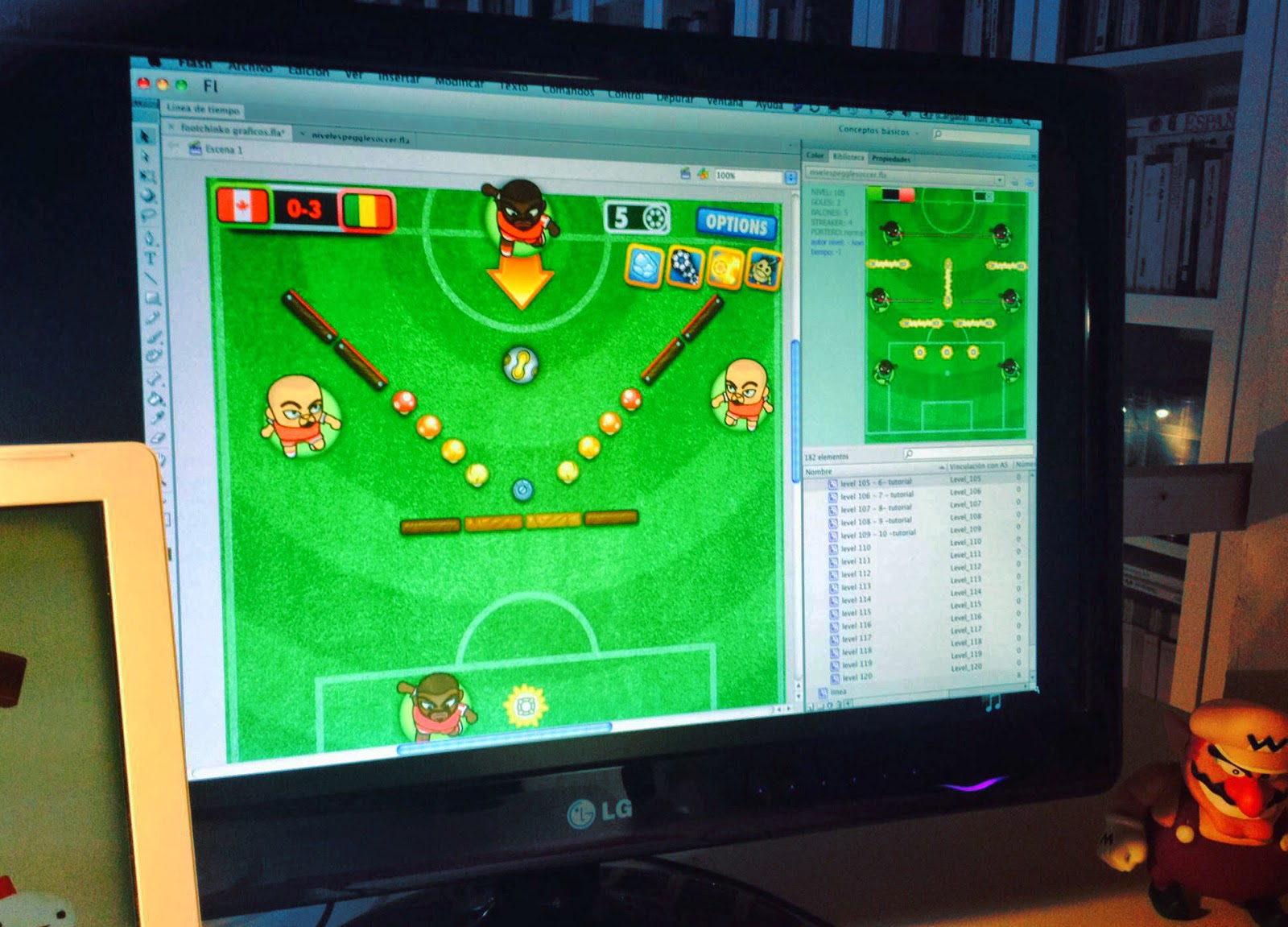
Enriqueto, had already used the Flash IDE as a visual level design layout that could be later parsed into data about items, their location and contextual level data (seconds, type of goalkeeper, etc.). Testing those levels was as easy as exporting the Shockwave file, running a json exporter, and testing the game on the browser.

Foot Chinko editing tools

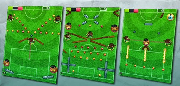
Ivan then edited a huge amount of levels in several iterations, discarding some of them due to technical limitations, and getting the most out of sketched ideas and emerging game mechanics. Some of Foot Chinko’s levels felt more skill-demanding and some other had a more random development, but the general idea was to keep a wide variety of levels, offering contrasted flavors. While a random level could be more appealing for a casual player, as the game progressed, those levels should be gradually replaced by more technical ones. If the resolution of an advanced match was just in the hands of luck, the more experienced players could get frustrated. Speaking about Foot Chinko‘s difficulty, it’s really hard to keep objectivity, since your skills will probably be above the average user, so try to make some early testing during this stage of the level design process.

Finally, we printed cards of every single level we had. That helped us to have an overall look, and making groups of levels (passive/interactive, slow/dynamic, easy/hard) and then arranging them alternatively, considering the general difficulty progression during the whole game and the partial difficulty progression of each tournament. Placing the cards on sticky panels was really useful to identify visual patterns and also make agile tweaks. The final step is testing that level progression with players. With the help of metrics we’ll be able to notice if there are some particular tough levels that break the natural progression of the game.

panels featuring all levels in Foot Chinko
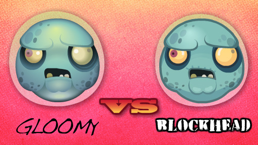
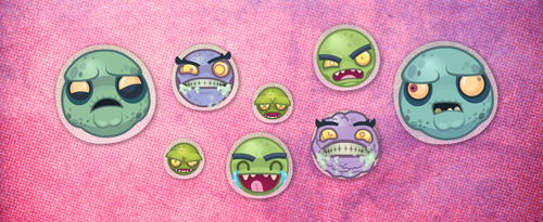
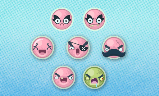
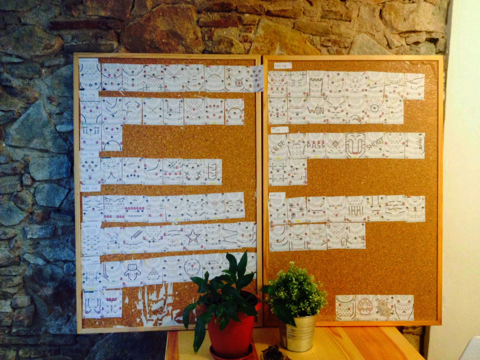
(The plants had strong arguments about the game flow, but the plastic one showed a deeper analytic vision)  

There are probably better ways to deal with level designing and arranging, so we would be glad to hear your suggestions. Take care!

Pocahontas Slots an HTML5 game about love, freedom and golden coins

Pocahontas Slots HTML5 game available for license
We are about to release Pocahontas Slots, a HTML5 slots machine available for non exclusive licensing.
The game mechanism itself is not particularly complicated, but instead, lots of work came from the visual effects tweaking and final polishing. You’ll certainly notice that once you play the game, specially if you are familiar with the current state of HTML5 games.

We’re eggstatic with our new HTML5 game!

Alien Kindergarten teaser
At the moment we are hatching these precious purple eggs at the studio. Having tea while sitting on an egg is a mind widening and pleasant experience for us. Also, the luminiscent green ooze gives us a very optimistic feeling about the creatures brewing inside. But I must admit there’s a bad point in all this situation: having someone else’s sticky slime in the crotch… (¬ -¬)”
More news soon!


Krazy Race. Work in progress

We are currently editing the last levels and giving the final polishing. Definitely our best work to date. It represents the beginning of something great.

At this stage we are considering the possibility of financing our next game through crowdfunding. Finally we feel confident enough developing games and want to explore new concepts at a higher degree of artistic freedom which wouldn’t be possible when working for clients.

Zombie Cells – Character Design (2/2)

Now we’re going to conclude our little analysis on character design, using the case of Zombie Cells as a reference.

In the previous entry we covered the first stages of char design. That includes the broad brainstorming, pencil sketching, first approaches and absurd ravings that must be identified and rejected before you find yourself falling in love with them.

In this stage of development we chose to depart from that comic/cartoonish style, that resembled Angry Birds, and try something less raw. We wanted some extra details, but not too much. Plain style is perfect, but there’s also a search for visual identity. You have to come to a balance point between simplicity on one side (works better for humorous purposes), and details, which may move you away from bold elegance but make the uniqueness of the design come into bloom.

Again some pencil work helps the designs come out more fluent. But once you have figured out the sketch, the basic design in outlines, you have to color it. Here we found a minor issue about color style, that is very illustrative. The first style makes use of gradients and works out better the volumes of the figure. But as you can see, the effect is quite gloomy, making thus the comic effect fade away. Just check out how different do they look, the exact two cells with just a different color style.

Finally we have to put all the cells together. They are not isolated beings, they must look fine as a group. Having the same visual design is something that we’ll take for granted at this point, but besides this, there’s also the color matching factor. When placed together they have to offer a cool group image (just like them). And assuming is a funny zombie game, we wanted them not to look too grayish or just  having variants over green tones. We wanted the whole zombie palette here, to get the richest variety of tones assuming we’re dealing with necrotic cells.

Enjoy the infection!


Zombie Cells – Character Design (1/2)

In the process of creating a new game/world you come to a moment when you have to settle it with inhabitants. At that moment the possibilities are overwhelming, but you must go down to earth and start placing some boundaries here and there. Once you know which kind of public the game is focusing on, and which kind of metafore would fit the game mechanics, it’s the time to call your pencil to action.
In this case, we had a liquid or low gravity environment, plus a massive spawning of beings. Once we dismiss the spacey theme, we went for the more stimulating body fluids’ setting ;). At some point the word “zombie” came out, and like victims of our time (the zombie golden-age) we just couldn’t help imagining hordes of zombie cells infecting a helpless host. In fact, we imagined the host was Justin Bieber… Down below are the first attempts.

The idea here is to try different approaches. To see which ones fit best and trace a line of action. Pencil is still the quickest tool. Although your inner child may just wish to start using colours, it’s better to try as many different styles in the less time possible, so let’s keep computer away.
OK, this time my inner child won over the battle, so I jumped quickly to Flash. That’s why the first two attempts, (down here) are just crap. Then I tried a simple cartoony style, most in the mood of Angry Birds. You can notice that specially in the last two of them.

And then… the magical moment, when everyone goes crazy. At some point you may come to a mad idea, an absurd concept that may be very funny. And then again, cold miss Logic comes back and hits your face with her glove. “Did you really think that zombie cells also needed to go soviet?”. – “Uhmmm… I guess it was not necessary, but it was cool as hell”.

It’s important to go through this phase in the early stages of design, or else, this mayhem will make you waste an undefined amount of precious time. In this case we dismissed the idea due to some deep and raw concerns about disappointed expectation.
In the second post about character design we’ll reveal the final stages of zombie cells infection. Take care!

Our current project

Those Medidor are some screen captures of cheap nfl jerseys the game currently under Angry developement at our workshop. Halloween We are looking forward to publishing it to test our theory about how sense of cheap nba jerseys humour can improve the performance of a game. Can funny elements make a game Público more appealing and played?
The type Perchè of game v?h?n we were asked to replicate was somehow a dull starting point. We wanted to enrich its gameplay without changing the original concept by adding funny elements and weird cheap mlb jerseys characters like a frog riding Construction on a toxic cloud.
We’ll keep you informed!